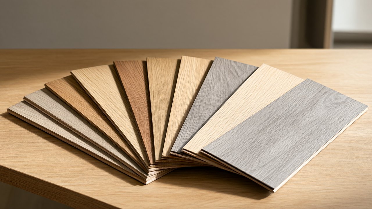

Choosing a floor is the most visible design decision in most renovations, and color sets the tone before any furniture, paint, or trim is selected.
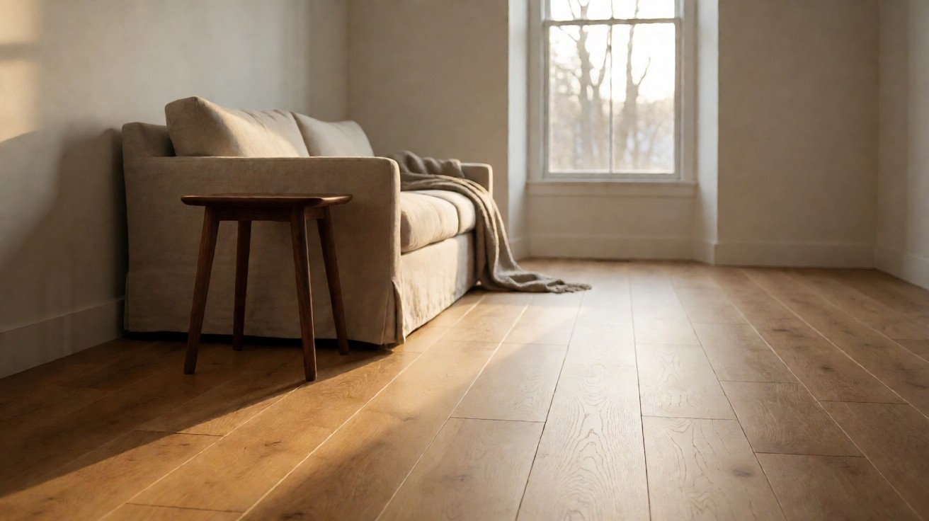
A mid tone oak at 45 to 55 LRV hides daily wear and pairs with most cabinets, while a matte finish under 25 gloss units keeps scratches less visible.
How Flooring Color Shapes a Room
Floor color is the largest single surface in most rooms, so it sets the visual temperature before furniture or wall paint does.
Pale floors reflect more light and make a room read larger, while deep floors absorb light and add weight. A useful rule is to match the floor tone to the largest fixed element in the room, such as kitchen cabinets or a fireplace surround, so the scheme feels intentional rather than accidental.
Light reflectance value, or LRV, is a 0 to 100 scale that designers use to compare surfaces.
A pale oak floor can sit near 55 to 65 on that scale, while a dark walnut floor can sit near 10 to 15. The difference changes how much artificial light a room needs after sunset. Rooms with north facing windows often benefit from floors above 40 LRV, because natural light in those rooms is cool and limited.
Color also affects cleaning perception. Mid tone floors with visible grain hide dust and pet hair better than very light or very dark floors. That is one reason medium brown oak remains common in family homes. The choice is not only about taste; it is about how much daily maintenance a household will tolerate.
Understanding Undertones in Flooring
Undertone is the color that sits beneath the main color. A floor can be brown with a yellow, red, pink, or grey undertone, and that undertone decides whether it harmonizes with walls and cabinets. Two floors that look similar in a showroom can clash once they are installed against white trim or grey walls.
Warm undertones, such as honey or amber, pair well with cream, beige, and warm wood furniture.
Cool undertones, such as ash grey or taupe, pair well with crisp white, blue grey, and black accents. Neutral undertones are rare in natural wood, so most floors lean one direction. Testing samples side by side under the room’s own lighting is the only reliable way to read an undertone.
Lighting changes undertone more than most buyers expect. Incandescent bulbs warm a floor, while daylight balanced LEDs reveal grey. A floor that looks golden at noon can look pink under warm lamps at night. Always view samples at the times of day when the room is used most.
| Undertone | Common Floors | Best Paired With |
|---|---|---|
| Warm | Honey oak, amber maple | Cream, beige, warm wood furniture |
| Cool | Ash grey, taupe oak | Crisp white, blue grey, black accents |
| Neutral | Natural white oak | Most palettes, adjust with textiles |
What Undertone Does This Wood Show?
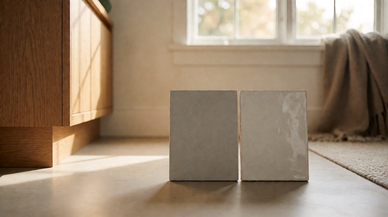
Hold a plain white card next to the sample and compare the shadow color. If the shadow looks yellow or orange, the undertone is warm. If it looks blue or violet, the undertone is cool. If it looks greenish, the sample may be a red brown that needs careful pairing.
Pattern Layouts That Change Perceived Scale
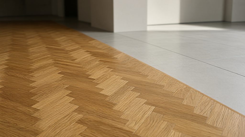
Pattern direction controls how large or small a room feels. Long planks laid parallel to the longest wall stretch the room visually. Herringbone and chevron patterns add movement and can make a narrow hallway feel wider. Large format tiles reduce grout lines and create a calmer field, while small tiles add texture and grip.
Plank width also changes scale. Narrow strips around 2.25 inches read traditional and busy. Wide planks from 5 to 7 inches read modern and expansive. Mixing widths can look custom, but it requires careful layout planning so joints do not cluster. The National Wood Flooring Association publishes layout and installation guidance that is worth reviewing before ordering material.
Pattern scale should match room scale. A bold herringbone in a small powder room can feel crowded, while the same pattern in a large entry hall feels grand. Designers often reserve complex patterns for focal zones such as foyers, and use straight lay in adjoining rooms for balance.
Finish Sheens and How They Wear
Finish sheen is measured in gloss units at a 60 degree angle, and it ranges from near zero for matte to above 70 for high gloss. Matte and satin finishes, roughly 10 to 35 gloss units, are popular because they hide micro scratches and footprints. Semi gloss and high gloss finishes look dramatic but show wear faster in busy homes.
Sheen also changes color perception. Higher gloss reflects more light, which can make a dark floor look lighter and more active. Lower gloss keeps color stable and closer to the raw wood tone. For households with pets or children, satin is often the practical middle ground.
Finish type matters as much as sheen. Oil modified urethane, water based urethane, hardwax oil, and aluminum oxide finishes each have different cure times, repair methods, and maintenance needs. Water based finishes can cure in 24 hours, while oil modified finishes can take 7 days. Always confirm the manufacturer’s care instructions before choosing a cleaner, because the wrong product can dull or strip a finish.
| Sheen Range | Gloss Units | Best For |
|---|---|---|
| Matte | Under 15 | Busy homes, pets, rustic looks |
| Satin | 15 to 35 | Most rooms, balanced look |
| Semi gloss | 35 to 55 | Formal spaces, easy cleaning |
| High gloss | Above 55 | Low traffic, dramatic effect |
Which Sheen Hides Scratches Best?
Matte and low satin finishes hide scratches best because they scatter light instead of reflecting it directly. High gloss finishes act like a mirror and make every mark visible. If scratch hiding is a priority, choose a finish under 25 gloss units and a textured surface such as wire brushed or hand scraped.
Matching Floors to Cabinets and Walls
A reliable method is to keep floors and cabinets in the same undertone family while varying lightness. For example, light oak floors with medium oak cabinets can work if both share a warm undertone, but identical tones can look flat. Contrast creates definition: a light floor with dark cabinets, or a dark floor with light cabinets, usually looks more deliberate.
Wall color should be chosen after the floor is fixed, because walls are easier to repaint. Grey walls pair well with cool or neutral floors, while cream and warm white walls pair with warm floors. When in doubt, choose a floor with a neutral undertone and adjust walls and textiles to steer the room warm or cool.
Fixed elements such as stone countertops and tile backsplashes also set limits. Pull a flooring sample next to those materials and check for undertone clashes. A floor that fights a countertop undertone is difficult to fix later without replacing one of them.
Wood Species and Natural Color Range
Species sets the baseline color and grain pattern. Oak is light to medium brown with strong grain. Maple is pale cream with subtle grain. Hickory ranges from blonde to dark brown with dramatic contrast. Walnut is rich dark brown with a smoother grain. Each species accepts stain differently, so a sample of the actual product matters more than a species name.
Natural color variation is expected and is part of the appeal of real wood. The National Wood Flooring Association grading rules describe how much color and character variation to expect in each grade. NWFA guidance is a useful reference for grade selection. Clear and select grades are more uniform, while character and rustic grades show knots, mineral streaks, and wider color range. For more detail on grades and grain, see hardwood grades, grain patterns, and natural color variation.
Stained floors can move far from the natural color, but the underlying grain still shows through. A dark stain on oak keeps visible grain, while the same stain on maple looks more uniform. Always request a sample of the finished product, not just the raw species.
Tile, Stone, and Patterned Surfaces
Tile and stone introduce patterns that wood cannot replicate, including veining, geometric mosaics, and encaustic looks. Large format porcelain can mimic wood or stone with fewer grout lines, which suits modern interiors. Natural stone such as marble and travertine has unique variation, so ordering extra material for matching is wise. ANSI A137.1 governs tile dimensional and performance requirements, and ASTM C1028 measures slip resistance for tile surfaces.
Tile finish affects slip resistance and maintenance. Polished tile is smooth and reflective, while honed, matte, and textured finishes offer more grip. TCNA guidelines cover tile installation and substrate preparation. For a deeper comparison of tile finishes, see polished versus honed versus matte versus textured tile finishes. Grout color also changes the look: matching grout creates a seamless field, while contrasting grout emphasizes pattern.
Patterned tile can act as a rug effect in a foyer or bathroom. When using strong pattern, keep surrounding floors and walls simple so the design does not compete. Scale matters here too: a small mosaic feels busy in a large room, while an oversized pattern can look awkward in a small one.
Selecting a Finish for High Traffic Areas
Entryways, kitchens, and hallways need finishes that resist abrasion and moisture. Aluminum oxide finishes on prefinished hardwood are among the most wear resistant options for residential use. For tile, porcelain with a high wear rating suits heavy traffic. For resilient floors, look for a thick wear layer and a urethane top coat. A 20 mil wear layer and a 3/4 inch plank thickness improve long term durability in these zones.
Texture helps in high traffic zones because it hides wear. Wire brushed, hand scraped, and matte textured surfaces disguise small scratches better than smooth glossy ones. The tradeoff is cleaning: deeper texture can hold dirt, so choose based on the balance of durability and maintenance you prefer.
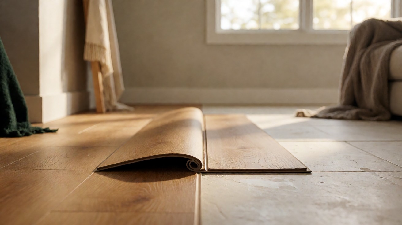
Transitions between rooms should be planned with the same attention as the main floor. A change in material or color at a doorway can look intentional if it aligns with a natural break, or accidental if it cuts across a sight line. For cost planning around transitions, see flooring transitions, trim, and finishing costs.
Sampling and Testing Before You Commit
Never choose a floor from a small chip alone. Order full size samples or view a installed showroom area, and place the sample flat on the floor in the actual room. View it in morning, afternoon, and evening light, and next to cabinets, trim, and furniture.
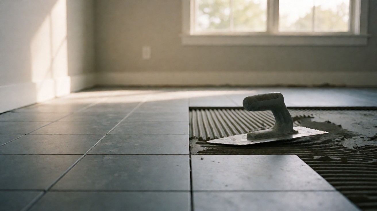
For wood, acclimate samples to the room’s humidity and temperature for at least 48 hours before judging color, because wood shifts slightly with moisture. For tile, lay several pieces together to see batch variation and grout joint width. For patterned materials, dry lay a section to check repeat and alignment. Order 10 percent extra material for cuts and waste, and allow 1/8 inch grout joints on tile.
How Many Samples Should You Test?
Test at least three options, and no more than six, to avoid decision fatigue. Include one lighter, one darker, and one mid tone relative to your target. If all three fail, adjust the target undertone rather than testing more of the same.
Common Design Mistakes to Avoid
Choosing a floor that matches the cabinets exactly is a common mistake; it removes contrast and makes the room look flat. Ignoring undertones is another: a grey floor with warm honey cabinets can look accidental even when both are attractive alone. Also avoid selecting a finish without considering maintenance, because a high gloss floor in a busy home quickly shows wear.
Another mistake is forgetting sight lines. Floors are visible from adjacent rooms, so a bold change at a doorway can disrupt flow. Plan the whole floor plan as one scheme, even if materials change by room. Consistency in undertone across materials often matters more than matching color exactly.
Finally, do not rely on showroom lighting. Showrooms are bright and even, while homes have mixed light and shadows. A floor that looks perfect under showroom lights can look dull or yellow at home. Testing in the actual space prevents most of these errors.
Maintenance and Long Term Appearance
Design choices should anticipate aging. Light floors show stains but hide dust. Dark floors show dust and scratches but hide stains. Mid tone floors balance both. Matte finishes hide wear, while glossy finishes show it. Choose based on the household’s tolerance for visible aging.
Maintenance routines also affect appearance over time. Use manufacturer approved cleaners, control humidity between 30 and 50 percent for wood, and add felt pads under furniture. For tile, seal grout as recommended and avoid acidic cleaners on natural stone. Good maintenance preserves the design intent for years.
If you are comparing broader flooring categories, the types of flooring overview and the hardwood flooring guide provide useful context for color and pattern decisions across materials. For professional guidance on wood floor design and installation standards, consult the National Wood Flooring Association.
PY